teamative was formed through the merger of several companies. What they brought with them: years of successful collaboration, a shared mindset, and the vision of uniting a distinctive business model in one brand. What this required: an identity that makes all of that visible.
What our name promises, our icon makes visible: moving people, teams, and companies forward through collaboration. timy is the “t” of teamative in motion – minimalist in form, concise in meaning.
Our brand promise is the essence of what defines teamative: with us at your side, it works – across our portfolio, project sizes, and constellations. For companies, teams, and individuals who work with, for, or at us.
tech Green as an anchor – precise, stable, refined. What surrounds it: a system of distinctive accent and neutral tones that reflects the warmth and approachability of our brand.
Our house typeface integrates seamlessly into our visual system – functional in detail, strong in presence, consistent in application.
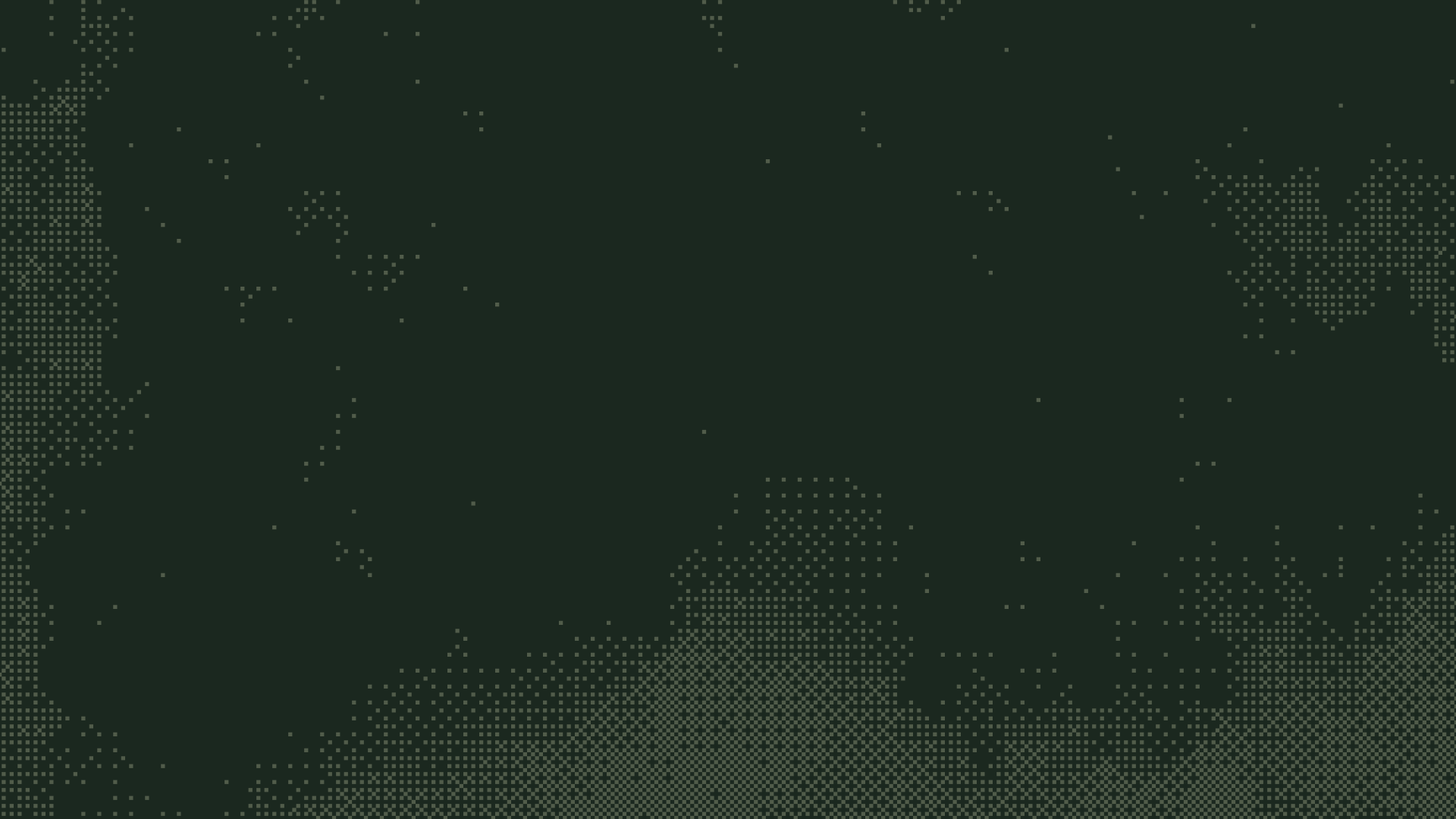
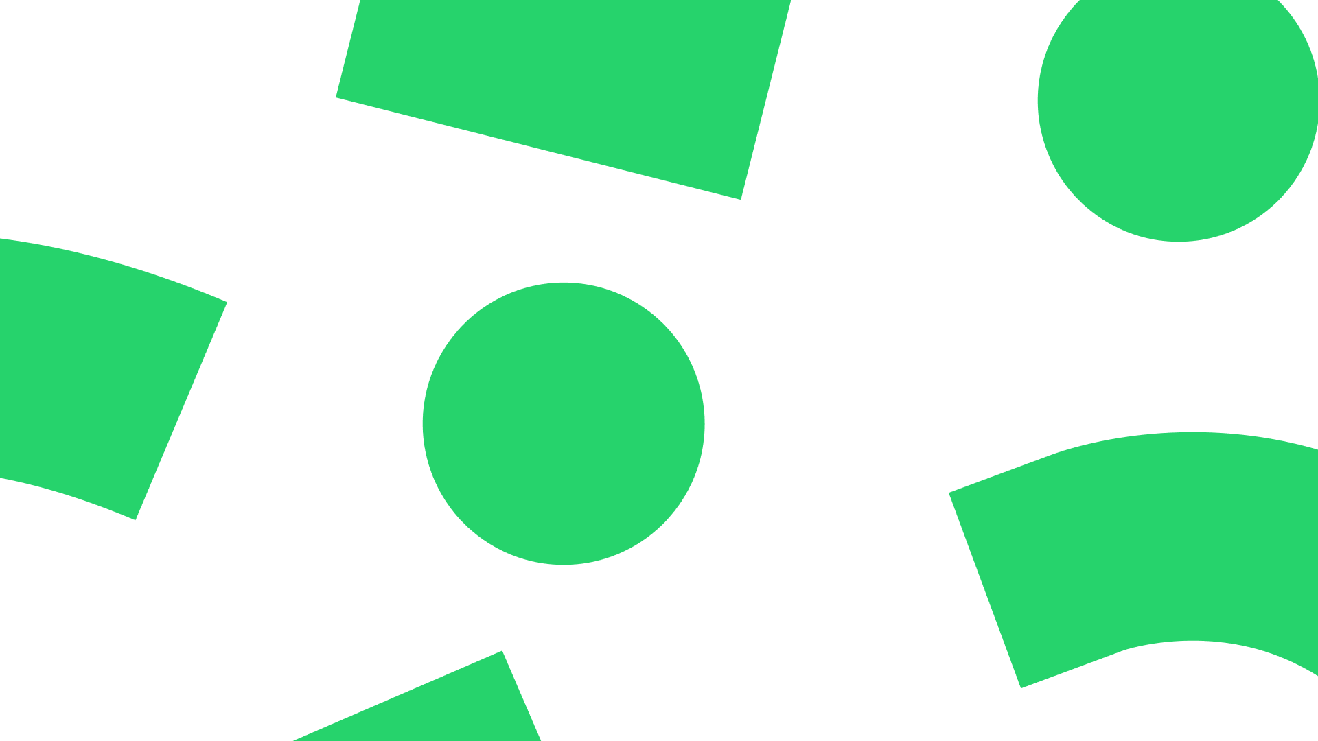
Our elements reflect the duality, scalability, and dynamism of our brand. The technological side of our project business is complemented by the open pattern for the people business – all developed from our logo.


.avif)